
Browse Articles
Select a Product
null Support Directory
Browse all null articles. (Last Updated
No articles found.
Search Results
No articles found.
Storyline 360: The Modern Player
Article Last Updated Jan 16, 2026
This article applies to:
The player is the frame around your slide content that holds navigation features, such as the menu and seekbar. In Storyline 360, you can choose the classic or modern player.
The modern player gives desktop and mobile learners a unified experience that’s consistent across all devices. It scales smoothly to fill learners’ browsers on every screen, large and small. And it’s easy to customize.
Here’s an example of how the modern and classic players compare on computers and mobile devices. Click each image to enlarge it.
|
Modern Player |
Classic Player |
|
Desktops & Laptops 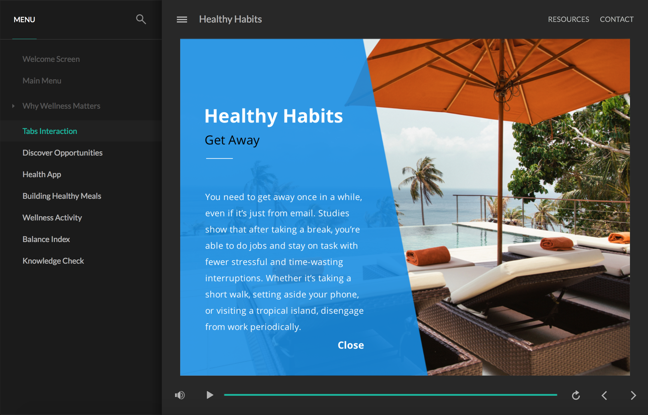 |
Desktops & Laptops  |
|
Tablets  |
Tablets 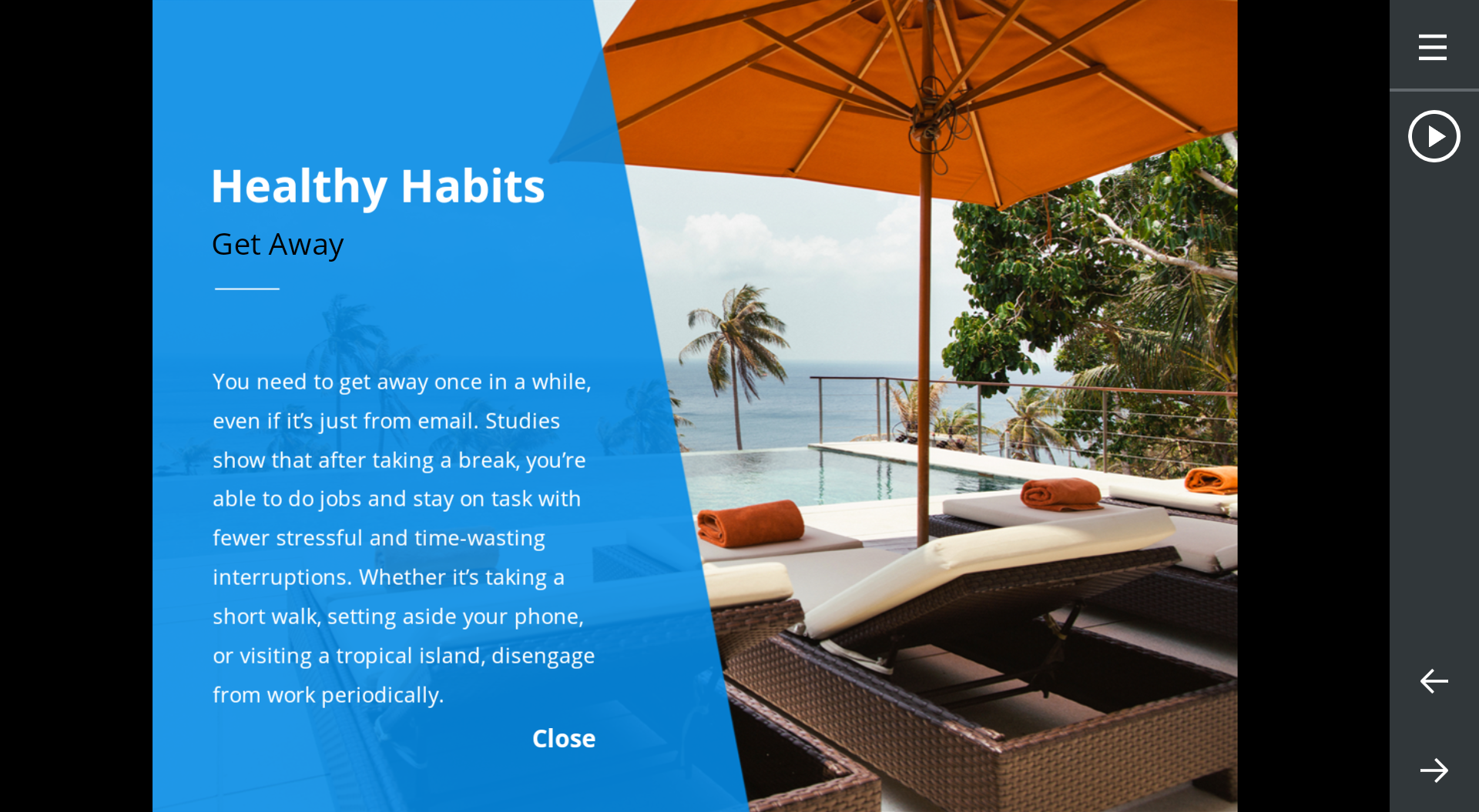 |
|
Smartphones  |
Smartphones  |
Here’s how to switch to the modern player and customize its settings:
- Switch to the Modern Player Style
- Choose Player Features
- Customize the Player Colors
- Switch to the Modern Feedback Style
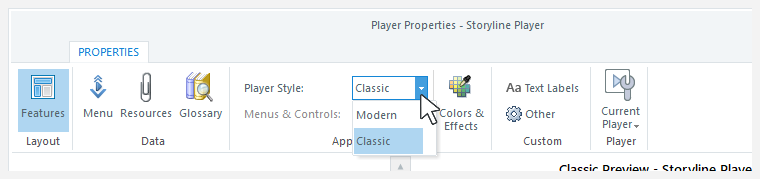
Switch to the Modern Player Style
New projects automatically use the modern player, so you only need to choose the features you want to include and customize the settings. Learn more.
Existing projects will continue to use the classic player by default, but you can switch to the modern player at any time. Go to the Home tab on the ribbon, click Player, then use the Player Style drop-down list to choose Modern. You can switch back to the classic player at any time.
Choose Player Features
The modern player style boasts more exclusive player features, as described below.
|
Modern Player |
Classic Player |
|
Enable or disable the play/pause button and seekbar independently. |
Enable or disable the play/pause button and seekbar as a single unit. |
|
Make the seekbar conditional so learners can't skip ahead until they've completed each slide. |
The classic player doesn't have a conditional seekbar. |
|
The seekbar appears across the bottom of the screen on all devices and orientations except smartphones in landscape mode. On smartphones in landscape mode, the seekbar is a circular indicator that travels around the play/pause button. When a slide is paused or it finishes playing, the seekbar changes to a line across the bottom of the screen. |
The seekbar appears across the bottom of the screen on desktop computers and tablets/smartphones in portrait mode. The seekbar is a circular indicator that travels around the play/pause button on tablets and smartphones in landscape mode. |
|
The logo appears on desktop computers and tablet devices. Due to limited screen real estate, it doesn't show on smartphones. You can add alt text to your logo so it's accessible to screen readers and other assistive technologies. |
The logo appears on desktop computers but not tablets or smartphones. The classic player doesn't support logo alt text. |
|
You can choose to collapse the sidebar by default, allowing learners to expand it when they need it. On small screens, the sidebar automatically collapses to give your content more room. |
The sidebar is always expanded on desktop and laptop computers. It’s always collapsed on mobile devices. |
|
Topbar tabs are always on the side of the player opposite the sidebar. If your sidebar is on the left, your topbar tabs are on the right. And if your sidebar is on the right, your topbar tabs move to the left. On small screens where there isn’t enough room to display topbar tabs, they’ll collapse into a drop-down menu represented by three dots. To see your topbar tabs, click the dots. |
You can have topbar tabs on both the right and left sides of the player. On tablets and smartphones, topbar tabs automatically collapse into the responsive mobile player. To see your topbar tabs, just click the menu icon (☰). |
|
Quickly turn off all modern player features for a chromeless look by flipping a switch. |
Turning off all classic player features for a chromeless look takes more time and effort than the modern player. Details here. |
|
Choose a style for navigation buttons. Previous, next, and submit buttons can be icons, text, or both icons and text. Due to limited space on smartphones, they’ll always be icons. |
On desktop and laptop computers, navigation buttons are always text. On tablets and smartphones, they’re always icons. |
|
By default, the modern player scales smoothly to completely fill learners’ browsers on every device and screen size. You also have the option to lock the player size or let it adjust to learners' browsers. Details here. Plus, you can add a player toggle to let learners view courses in full-screen mode. |
You can only lock the player size or let it adjust to learners’ browsers. Details here. |
|
Let learners explore at their own pace by choosing a course playback speed between 0.25x and 2x. |
The classic player doesn't support speed control. |
|
The light and dark themes of the modern player exceed WCAG Level AA guidelines for visual contrast and color by default. Details here. Or, you can define a custom background and accent color instead. |
You can make the classic player meet contrast guidelines by manually customizing the colors of each player component. Choose colors with a contrast ratio of 4.5:1 or higher. |
|
Customize your course start page with an image. You can add alt text to your cover photo so it's accessible to screen readers and other assistive technologies. |
The classic player doesn’t support cover photos. However, the course start page matches the top and bottom colors you set for Base>Main Background. |
|
Increase or decrease the font size for closed captions and player features independently. |
Increase or decrease the font size for closed captions and player features as a single unit. |
|
Choose two colors—one light and one dark—for the accessibility focus indicator so it's visible against any background. |
Choose a single color for the focus rectangle. |
|
If your course has background audio, learners can turn it on or off via the accessibility controls. |
The classic player supports accessibility controls. However, it doesn't support background audio. |
|
All modern player features are supported on desktop computers and mobile devices. |
All classic player features are supported on desktop computers, and most are supported on mobile devices. Explore this interactive demo to know which classic player features work on tablets and smartphones. |
Learn how to customize all the player settings in the Storyline 360 user guide.
Tip: Go Chromeless

Want to turn off all the player features for a chromeless design? With the modern player, it’s easy to do. Just open the player properties and set the Menus & Controls option to Off. That’s it!

Your course won’t have a player at all. You’ll just see a black or white background behind your course, depending on the player theme you choose. And since the slides in your course won’t have navigation buttons, be sure to add your own custom navigation features to each slide.

You can make the classic player chromeless too. It just takes more work. You’ll need to turn off each player feature individually, turn off the previous and next buttons for each slide in the course, and make the player border transparent. Here’s how.
Customize the Player Colors
The modern player style makes customizing colors easy. Select a built-in theme or create your own theme, then choose an accent color from the color selector (the default accent color choices are your theme colors).
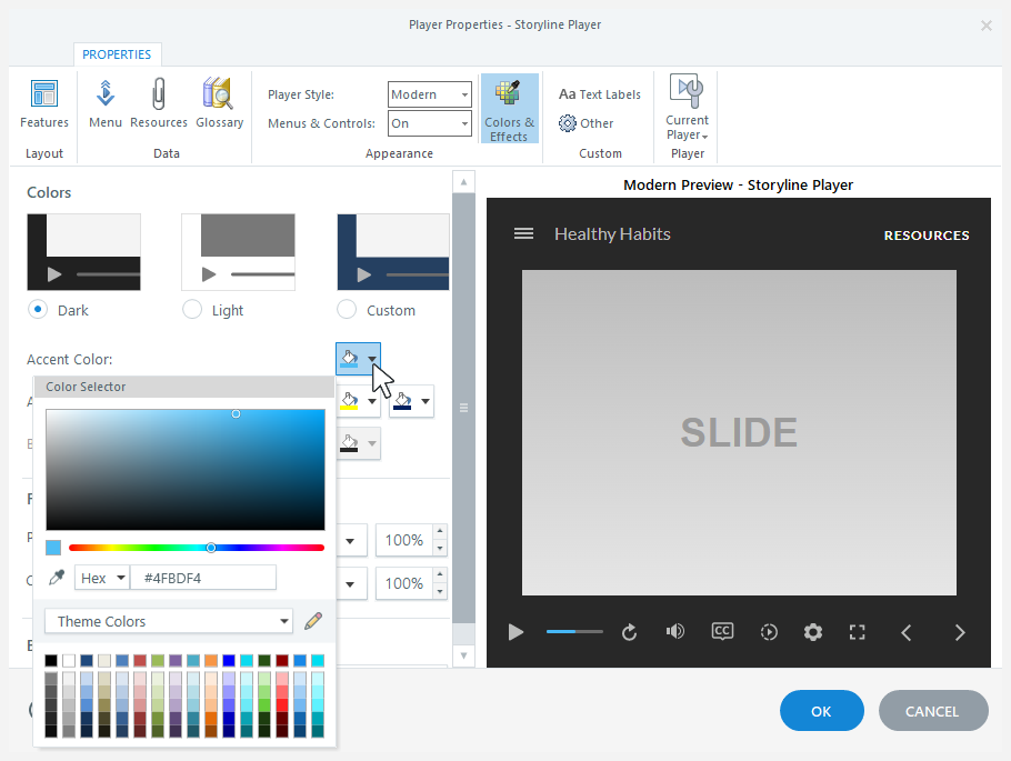
The neutral tones of the dark and light themes allow your content to be the focus of learners’ attention, while the player performs a supporting role in the background. And the accent color is used throughout the modern player to tie it all together. For example, the accent color highlights the current slide in the menu, identifies the selected tab in the sidebar, and shows the progress of the seekbar.
Note: When using the “Lock player size” or “Lock player size to fit browser” player-size option, you can customize the page background color. This color appears behind your published course, and learners may see it around the outside of your player frame. Click Colors & Effects on the ribbon, then choose a page background color using the color selector.
Switch to the Accessible or Modern Feedback Style
The modern player includes accessible and modern feedback styles for quiz slides.
New projects automatically use the modern feedback style, so you only need to enter your feedback text. And using the accessible feedback style for new projects instead is easy. Here's how.
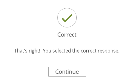
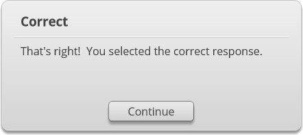
Here's an example of how the accessible, modern, and classic feedback styles compare. Click each image to enlarge it.
| Accessible Feedback |
Modern Feedback |
Classic Feedback |
 |
 |
 |