Browse Articles
Select a Product
null Support Directory
Browse all null articles. (Last Updated
No articles found.
Search Results
No articles found.
Rise 360: Modify and Manage Blocks
Article Last Updated May 7, 2026
This article applies to:
Managing blocks in Rise 360 is quick and easy. Floating menus appear when you hover over a block, giving you full access to organizational and customization settings. These options let you move, duplicate, or delete your block, edit block content, and adjust the design. You can also use the dedicated manage blocks sidebar to copy blocks to other courses or lessons and bulk-delete blocks.
- Undo/Redo Actions
- Move, Duplicate, and Delete Single Blocks
- Manage Blocks in Bulk (Beta)
- Edit Block Content
- Adjust Block Style
- Modify Block Format and Options
Undo/Redo Actions
In a lesson, quiz, or microlearning, the undo and redo buttons appear at the top of the Rise 360 interface and are greyed out until you take an action (such as adding content or deleting blocks). The undo/redo history lets you undo or repeat up to 50 subsequent actions. Once you undo an action, the redo button is enabled.
Undo/redo actions are available only for the current creator and on the current lesson/microlearning. If you leave or reload, the action history is reset. When using full-screen editors for blocks such as process or labeled graphic, it's possible to affect actions that aren't visible in the editor.
Note: Currently, entering the Custom Block editor resets the action history.
When working in localized courses, the undo/redo history persists across languages. It automatically switches to the language where the action was taken, but doesn't scroll to where the action was modified.
Move, Duplicate, and Delete Single Blocks
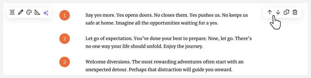
To move, duplicate, or remove a block, hover and click the Move up, Move down, Duplicate, or Delete icons in the quick action toolbar.
Manage Blocks in Bulk (Beta)
Click the Manage blocks icon at the top of the lesson to launch the dedicated block management sidebar.
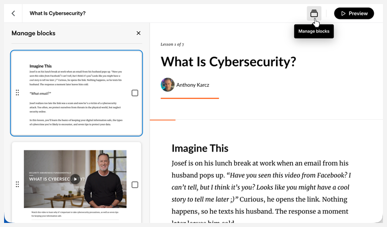
From here, you can move and delete blocks or copy them to another lesson or course. Select and deselect blocks by clicking them.
Move
On the left-hand side, grab the handle of the block you'd like to move and drag it to its new position in the lesson. The content on the right will scroll to the new placement. You can also select multiple blocks and drag them as a single unit.
Delete
Select blocks and click the trash can icon in the manage blocks toolbar at the bottom of the screen. Confirm by clicking Delete in the pop-up window.
Duplicate
Select blocks and click the Duplicate icon in the manage blocks toolbar at the bottom of the screen. From here you can:
- Duplicate: inserts copies under your currently selected blocks
- Copy to course: inserts copies in another course
- Copy to lesson: inserts copies in a lesson of the current course
When copying to a course, select the destination course. For copying to a course or lesson, select the destination lesson in the pop-up that appears. Click Copy. The blocks are added to the bottom of the lesson you selected. Click View to jump to the destination location.
Edit Content
Depending on the block, content can be edited in either a left-hand edit panel or a full-screen authoring experience.
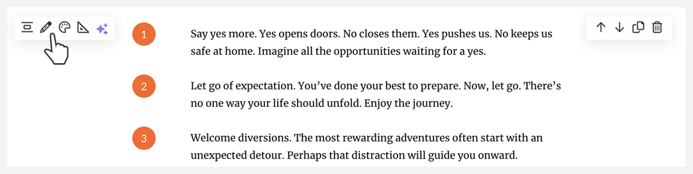
- Hover over the block and click the Content icon in the left-hand toolbar.
- Edit content in the left-hand edit panel or full-screen authoring experience that appears.
- Click the X or Close button in the upper right corner of the sidebar or screen to close it.
Adjust Block Style
In the left-hand toolbar, you have additional menus to adjust the style and format. You can also access AI Assistant tools if available for your selected block.
Make your content stand out by filling all the white space around your block content with the color of your choosing.
- Hover over the block and click the Style icon in the left-hand toolbar.
- Select a background color from the following options:
- Light
- Gray
- Theme
- Theme Tint
- Dark
- Black
- Custom
- Image
- Click X or outside the menu to close it.
Theme Colors
Theme and theme tint background colors are based on the course theme color. Depending on global contrast settings, text color changes when you choose a theme color option.
Custom Color
Choose a custom background color by entering the hex code or manually selecting a color. Selecting a custom background color enables Contrast options: Auto, Light, and Dark.
Select Auto from the drop-down list to ensure that text and graphic elements adhere to an accessibility-conformant 4.5:1 ratio. When selected, text and graphic elements change from light to dark as needed to preserve contrast.
When you select Light or Dark, training elements don’t automatically adjust and may not maintain contrast that's conformant with accessibility guidelines.
Note: In-line graphical elements (like numbers, bullets, and checkboxes) retain the theme color instead of adopting your custom color.
Image
When you select Image, an image is added as the block background. These images are random and vary from block to block. Use the image edit menu to upload, replace, or crop the image.
If the image background obscures your block content, try adjusting the Overlay. Select a light or dark transparent overlay, then adjust its opacity as needed by percentage. Overlay adjustments affect text contrast and in-line graphical elements. For instance, if you select a dark overlay, the text color will be light and vice versa.
Note: Buttons in button blocks are always either black or white, depending on the contrast options you select.
Modify Block Format and Options
The format menu contains your padding options as well as additional formatting elements for specific blocks.
Padding is the amount of blank space that appears before and after the block. While we find that a standard 30 pixels (px) of space gives content plenty of breathing room, you can adjust it to your liking by clicking the Format icon and then choosing between the Small, Medium, or Large padding options that appear.
Click the ellipses to reveal custom sliders. Increase or decrease the top and bottom padding using either the set options, sliders, or entering a value. You can choose as much as 200px of padding or as little as no padding at all. The padding sliders are linked by default. Click the Unlink Padding icon to adjust the top and bottom padding independently
Unique elements in multimedia and interactive blocks may also be edited in the Format menu, including labels, media size and position, button and marker colors, and interactive behavior.
Note: Color and contrast for Buttons and Button Stacks may be modified in the Format menu. Buttons in Process Interactions, however, use the theme color.